

Product, System
Qinglu Guo
Maryland Institute College of Art
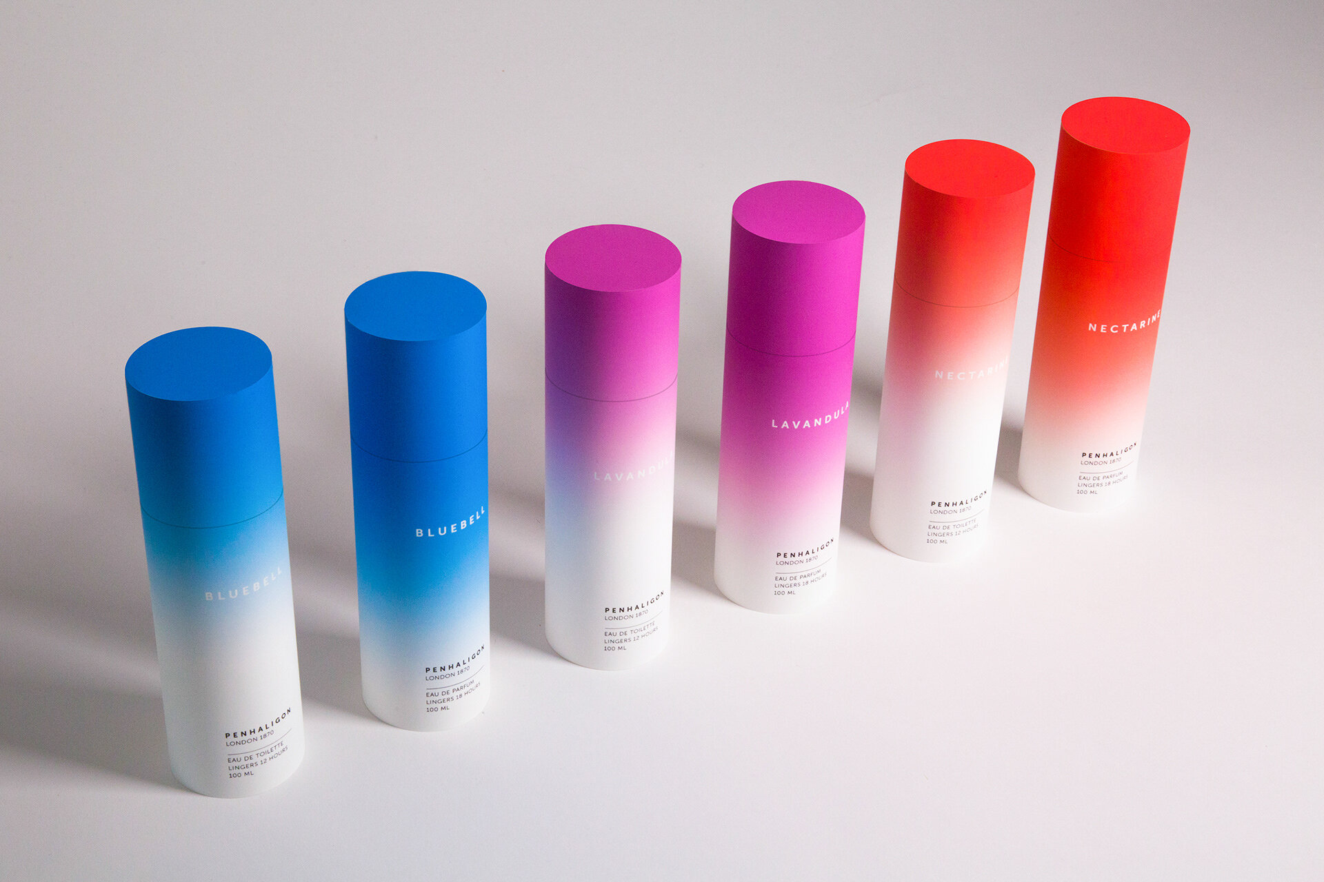
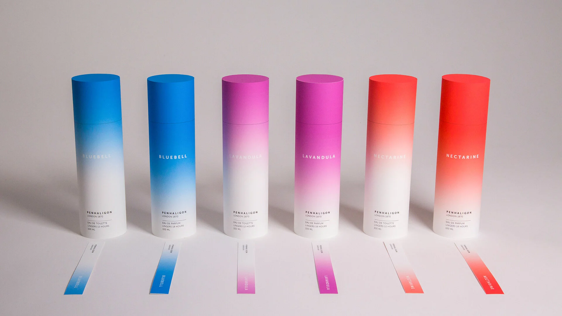
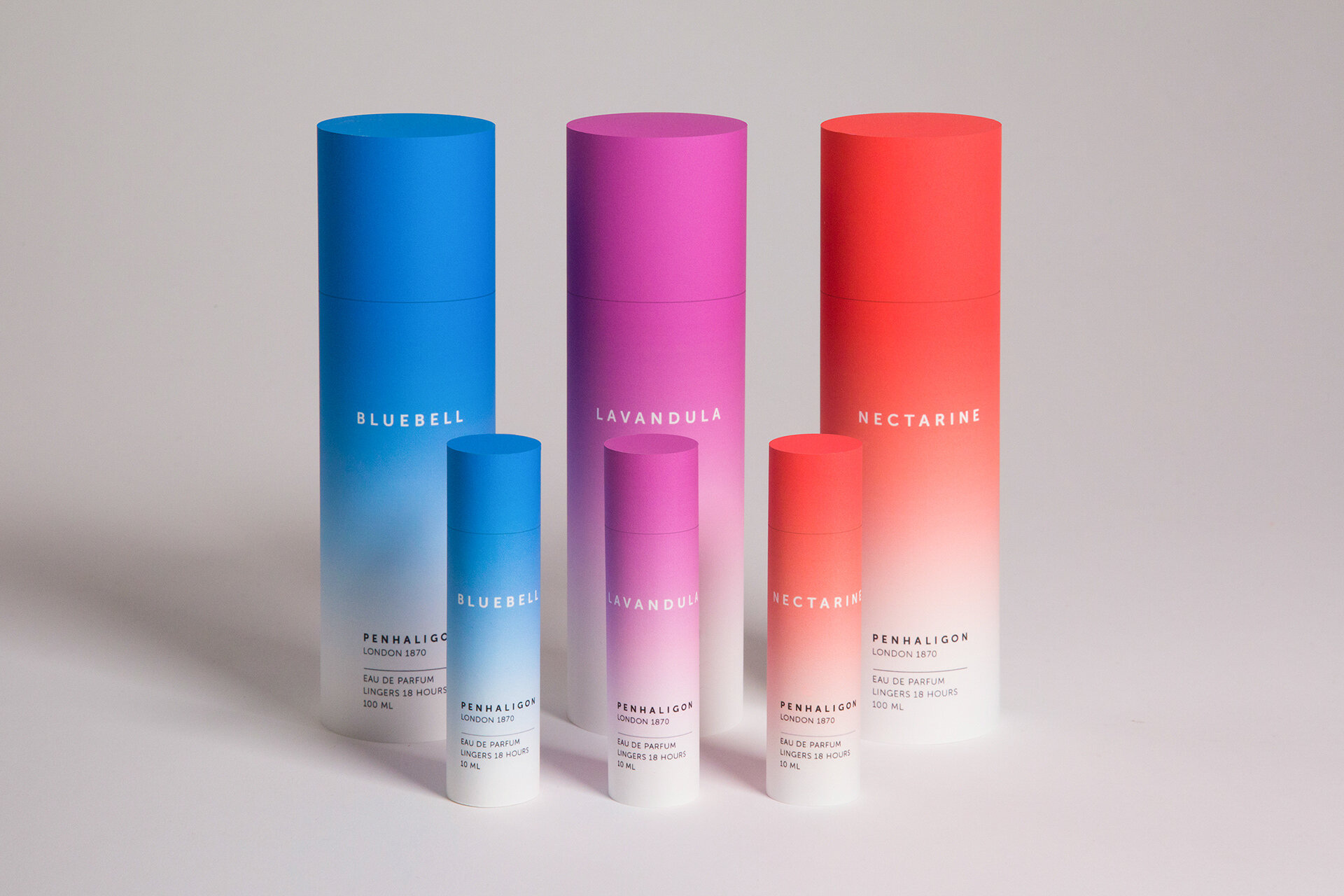
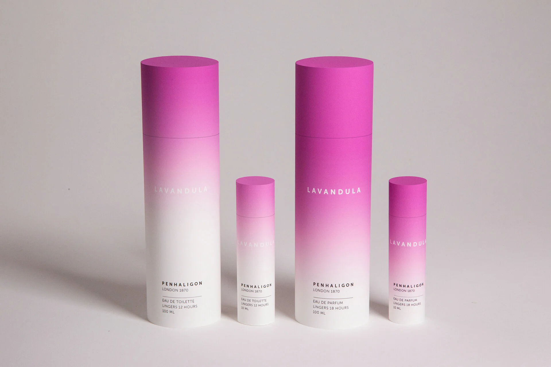
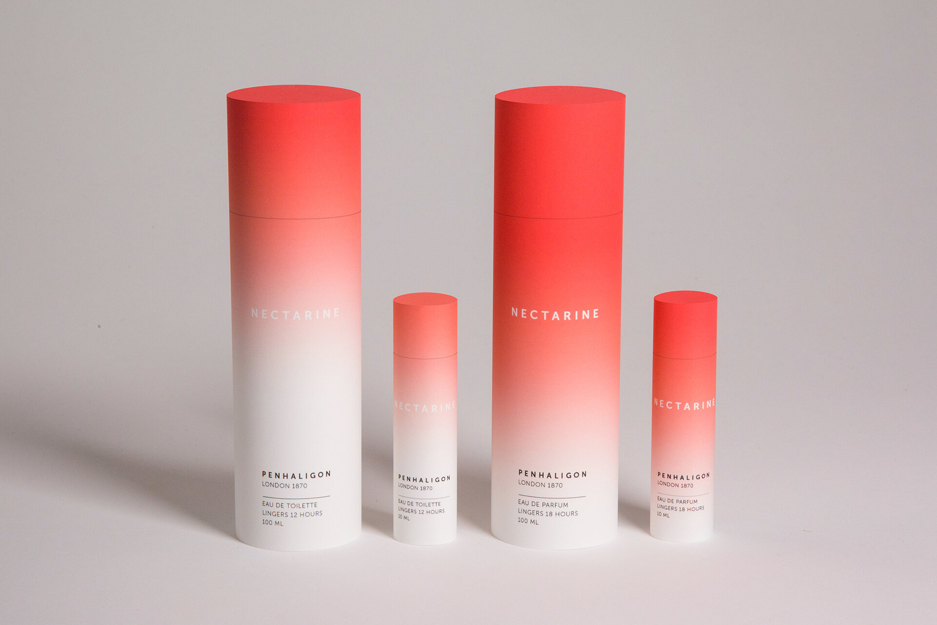
This is a brand shift project for Penhaligon’s, a British perfume house founded in 1870. The intended audience was perfume consumers. To address the problem that it's always hard for non-professionals to interpret the specification of perfumes from their unorganized labels, I designed a simple, intuitive, and creative system to label Penhaligon’s fragrances. I used color gradients, which visually feel like scents and sprays, to represent different concentrations of perfumes (Eau de Toilette and Eau de Parfum). I also applied the visual language to perfume tester stripes. This project was featured by The Dieline, Behance, and several popular design Instagram pages. I constructed my final packaging out of double matte paper prints, but I vision the real product to be made of recyclable material. Choosing colors was challenging for me. I spent a lot of time selecting colors that evoke specific scents and adjusting to help them work together.
This project was advised and mentored by my program director Jennifer Cole Phillips. With the help of our associate director Jason Gottlieb, I carefully lit and photographed my final product for my portfolio.